
Do you remember ‘the Brick’? 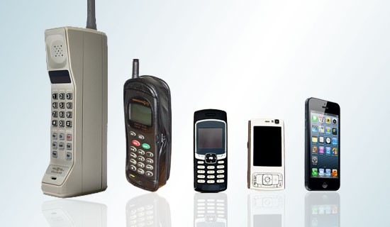 Our first incarnation of a mobile device released in Australia way back in 1987?
Mobile technology has sure come a long way since then!
The biggest advancement though, for the tourism and hospitality industry has to have been the introduction of the smartphone in 2008.
In only a few short years, Australia has one of the highest smartphone penetrations in the world. We’re booking flights, hotel accommodation, purchasing wine, making reservations, researching ‘where to buy’ or our latest holiday destination and we can do it all by tapping a few buttons on our smartphones.
And you know what else – according to a recent study by Google and Nielsen, three quarters of smartphone users after making inquiries, use their device to complete the purchase.
Thanks to ever evolving mobile technology, website design trends are changing and so are your customers expectations.
So how does that affect your hotel, hospitality, restaurant, winery or tourism business?
Quite honestly, if the primary touch-point and most valuable online asset – your website isn’t easily accessed via a smartphone or mobile device, you’re leaving money on the table!
Mobile Vs Responsive
The terminology surrounding mobile and responsive can get very confusing and is compounded as the technology expands and improves – so let’s get this straight!
Responsive websites
A responsive website is a website that responds to its environment.
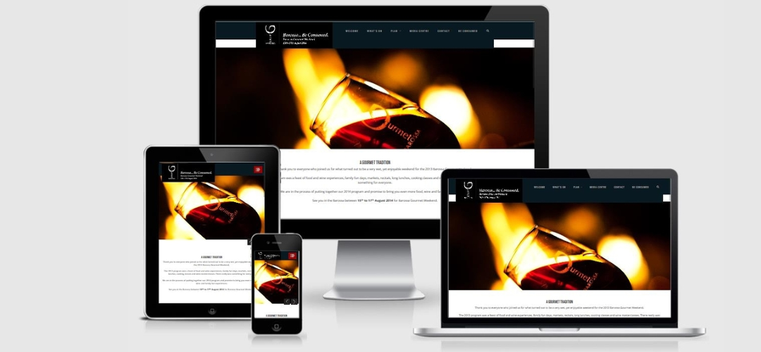
Responsive simply means it fits to the size of the screen on which it is being viewed – one website viewable on many devices. Usually it’s a desktop website that can also be viewed on all mobile devices such as smartphones and tablets.
In responsive design, the device does the work and automatically adjusts according to a device’s screen size (large or small) and orientation (landscape or portrait).
To find how responsive your website is to devices or indeed, if your website is responsive at all, we suggest checking your website url via a free tool. A few options we like to use include:
• Am I Responsive
• Responsive Design Checker
Mobile Websites
Mobile websites are a totally different kettle of fish!
It is a completely different website (built separately and hosted by a different domain name) and the content is generally limited to the most important elements (Book Now or Purchase with minimum text and imagery).
Things to Consider for a Mobile Website
Business Needs
As with everything you are doing online for your business, a mobile website should feed into your overall marketing strategy. Key factors to consider before even embarking on this process are
• Objectives
• Time
• Budget
Navigation
User experience is by far the most important component of a successful mobile website. This means that the navigation buttons can’t be tiny and the amount of interaction (i.e. clicking and entering data) should be minimal.
Performance
Just like your main website, your mobile website needs to be reliable and quick to load. To provide the best possible user experience, Google suggest a loading time of no more than one second.
A well quick loading, easy to navigate mobile website will be better at engaging visitors, which of course has the knock-on effect of search rankings and consequently, sales.
Branding
Branding is the practice of creating an instantly recognisable presence via logo, colour scheme or any other visual “cue”. Even though you don’t want heavy graphics with a mobile website, small graphic elements that instantly remind people of your brand will work well. This may simply translate to your colours and logo.
Content
This ties back to your objective and should reflect your already well-established PC website, as many components should be the same (in a simplified version), making it familiar and easy to use.
A strong call to action whether that be booking accommodation, purchasing wine, reserving a table. Whatever your end goal is on your website – make sure you have a strong call to action on your mobile website.
Mobile Website Example
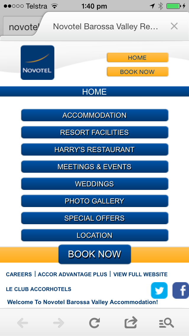
Novotel Barossa Valley Resort has a good example of a mobile website. The primary navigation is pared down to key actions and the big text and links are easy to tap. Secondary navigation at the bottom provides access to social channels and other important information without becoming over complicated. Content is a simplified version of their website. Load times are good and the call to action – BOOK NOW, is prominent and easy to use.
————————————–
Why not try access your business website on your smartphone. Can you easily book accommodation, purchase your favourite drop of wine or reserve a table? Just remember, if you are not happy with the results, your customers won’t be either.
Until next time…..